Fonts are one of the most important design element of your site. The fonts you choose set the tone for your brand, determine readability and can influence the conversion rate of your site.
Why use google fonts?
- You won’t find a better price: free!
- Easy to use and readily available in Showit and Canva.
- Often load quicker than other fonts (which plays into your conversion rate!).
- Available for commercial use.
- Part of a library of hundreds of fonts. No matter what style you need for your brand, you’re sure to find something for you.
How do I choose the best google fonts for my website?
When choosing a font, you want to define it’s purpose. Will it be used for your headers or paragraphs? Is it an accent font? Does it elevate or diminish your brand?
There are lots of things to be said about choosing and pairing the right fonts, but here are a few general guidlines to get you going:
- Chose fonts that compliment each other. For example, a serif font (one with small lines at the end of the letters, or “feet”) often pairs well with a sans serif (a font without those “feet” such as the font I’m typing with now). Additionally, if you’re using a bold font for your headings, consider a lighter body font to visually balance your page.
- Consider Legibility. Choosing fonts that are easy to read is incredibly important for your website because you want your visitors to be able to understand your message! If a font looks beautiful but is a hastle to read, you’ve missed an opportunity to connect with a visitor on your site.
- Styles that are in line with your brand. Different fonts evoke different responses and emotions. Make sure you pick a font that aligns with your brand idenity and the type of client you are targeting.
- Don’t overuse script fonts. Script fonts are beautiful and can add an elegant look to your site when used in moderation. But be careful of what information you communicate with a script since it can be hard to read. Save the really important info for your header font.
- Don’t use more than 3 different fonts on your website. Too many styles can leave your site feeling cluttered and confuse your visitors. When you only have 2 or 3 different fonts, you can be intentional about what text you pull attention to and emphasize.
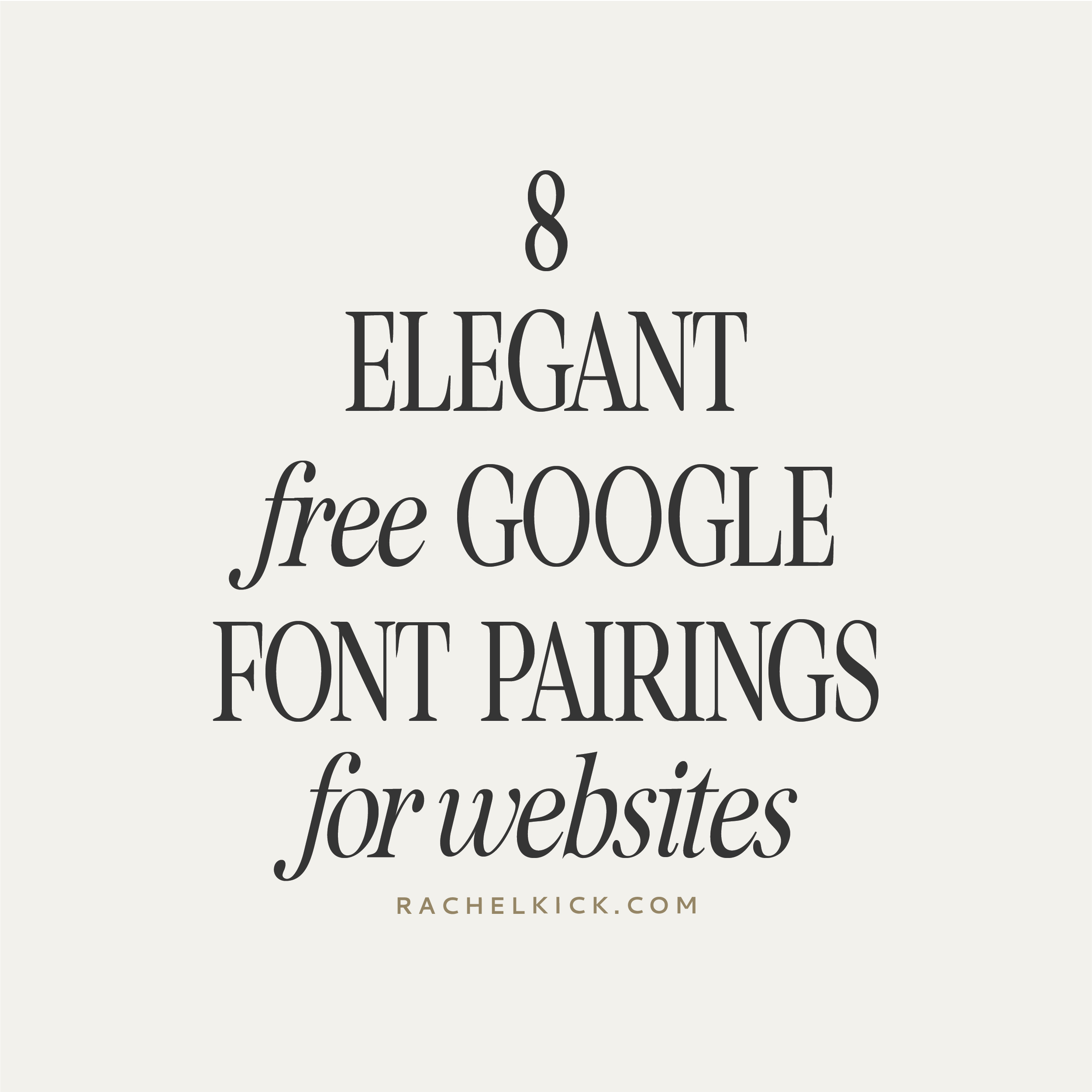
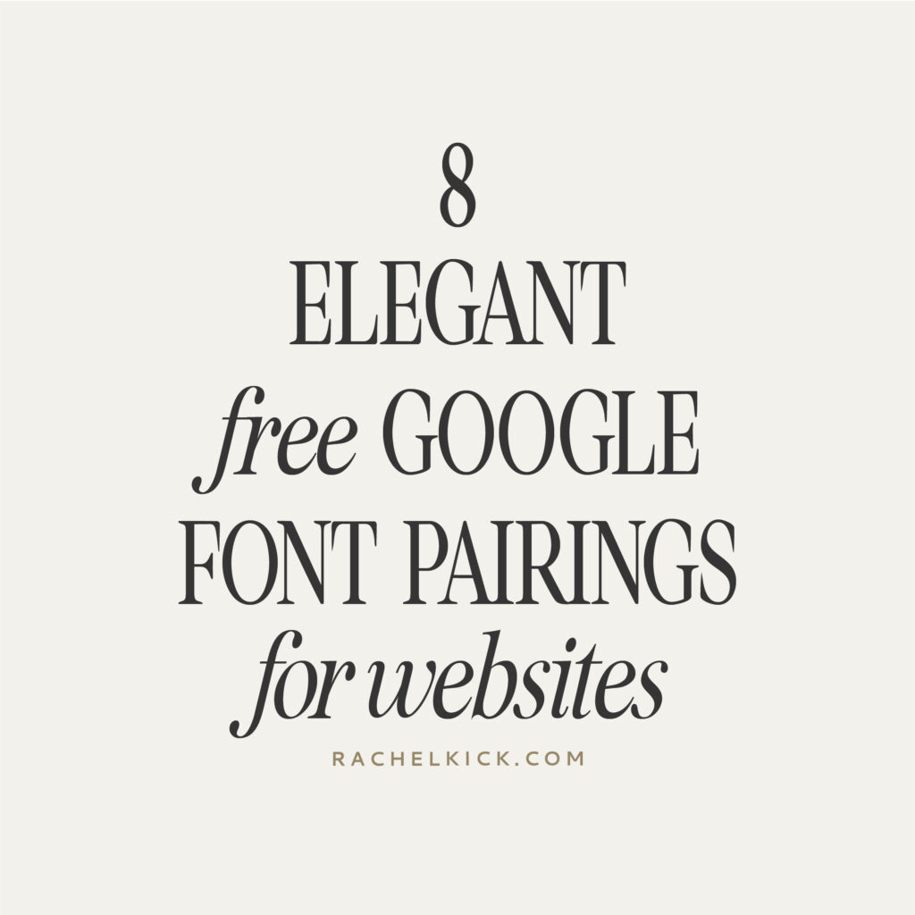
Here are 8 of my favorite google font pairings for websites!
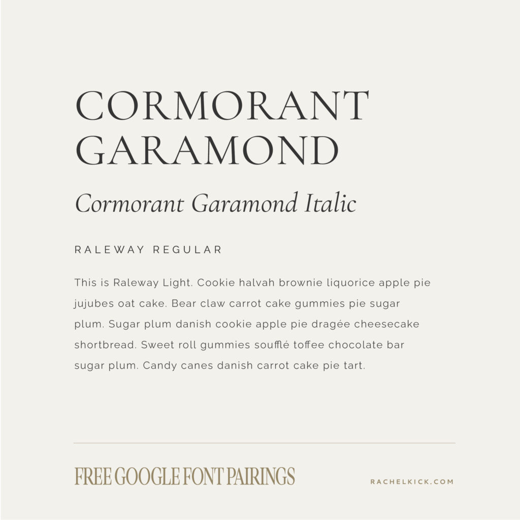
Cormorant Garamond
Cormorant Garamond is one of the most popular google fonts for its timeless and elegant look! It works great at any size and comes in a variety of styles including italics. It looks beautiful as a header font but also works wonderfully as a body font.
Pairs well with a clean serif like Raleway.
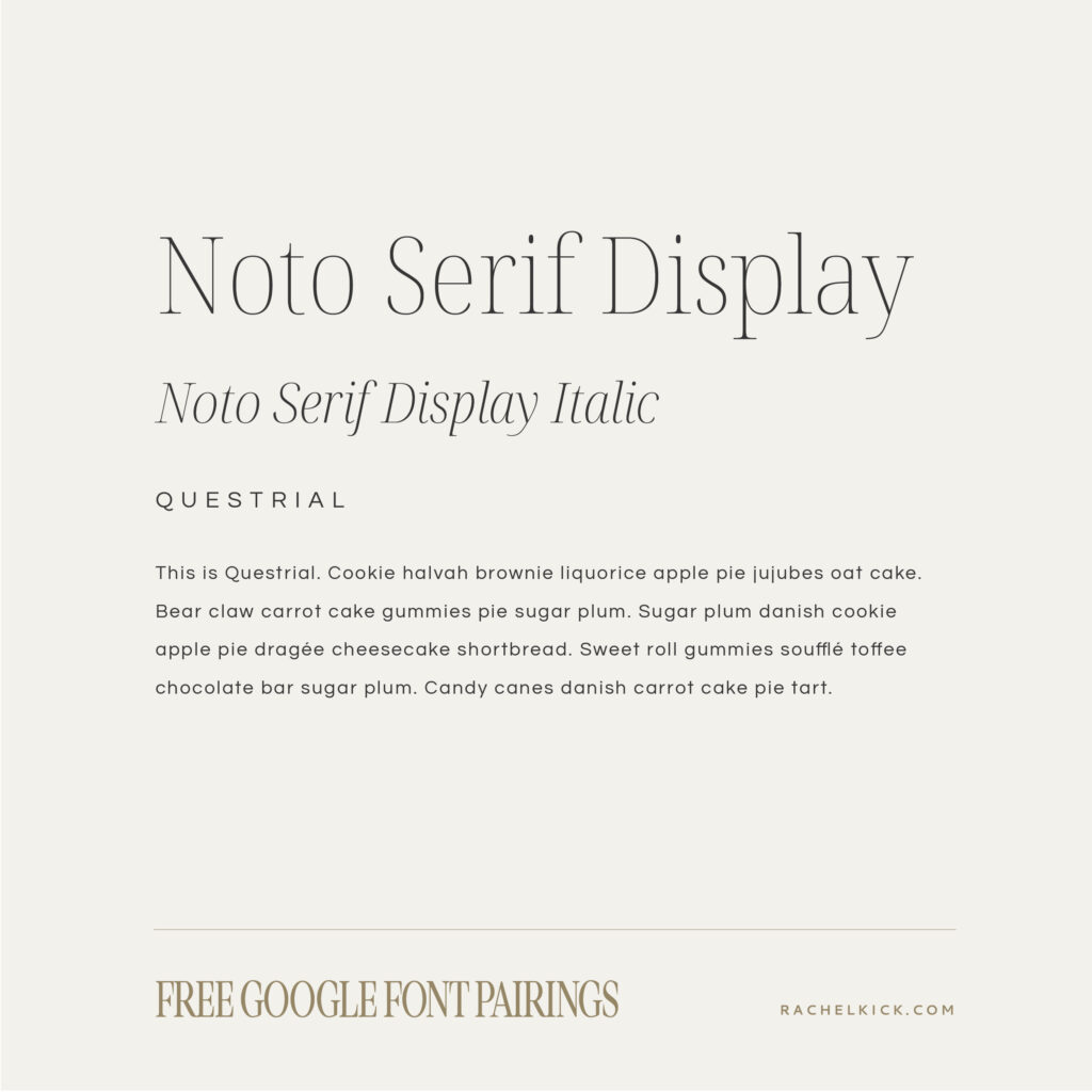
Noto Serif Display
Noto Serif Display is a sophisticated and modern font with beautiful italics and ligatures. It’s variety of weights make it incredibility versatile – the style shown is Semi-Condensed Thin.
Pair it with a clean and wide sans serif, such as Questrial.
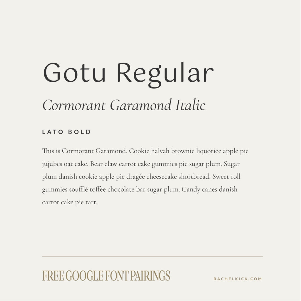
Gotu
Gotu has lots of natural elements like round curves and interesting use of weight. It’s unique but simple enough to be incredibly legible, even at small sizes.
Pair it with a simple sans serif like Lato or a classic serif such as Comorant Garamond.
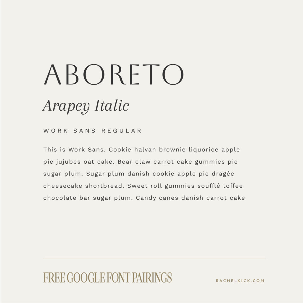
Aboreto
Aboreto is sophisticated with a hint of playfulness in it’s curves and angled strokes. The font is an all caps font which works best for the header text on your site. Pair it with a classy italic serif and simple sans serif and you have the ultimate font line up.
Pairs well with Arapey and Work Sans.
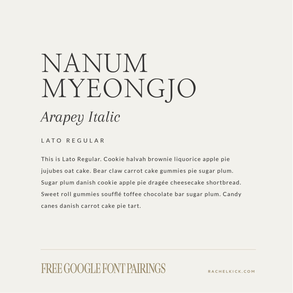
Nanum Myeongjo
Nanum Myeongjo is another classic font with a similar feel to Cormorant Garamond. It doesn’t include an italic but does have a bold style. It would work beautifully as header or body copy.
Pair it with Arapey Italic or Lato.
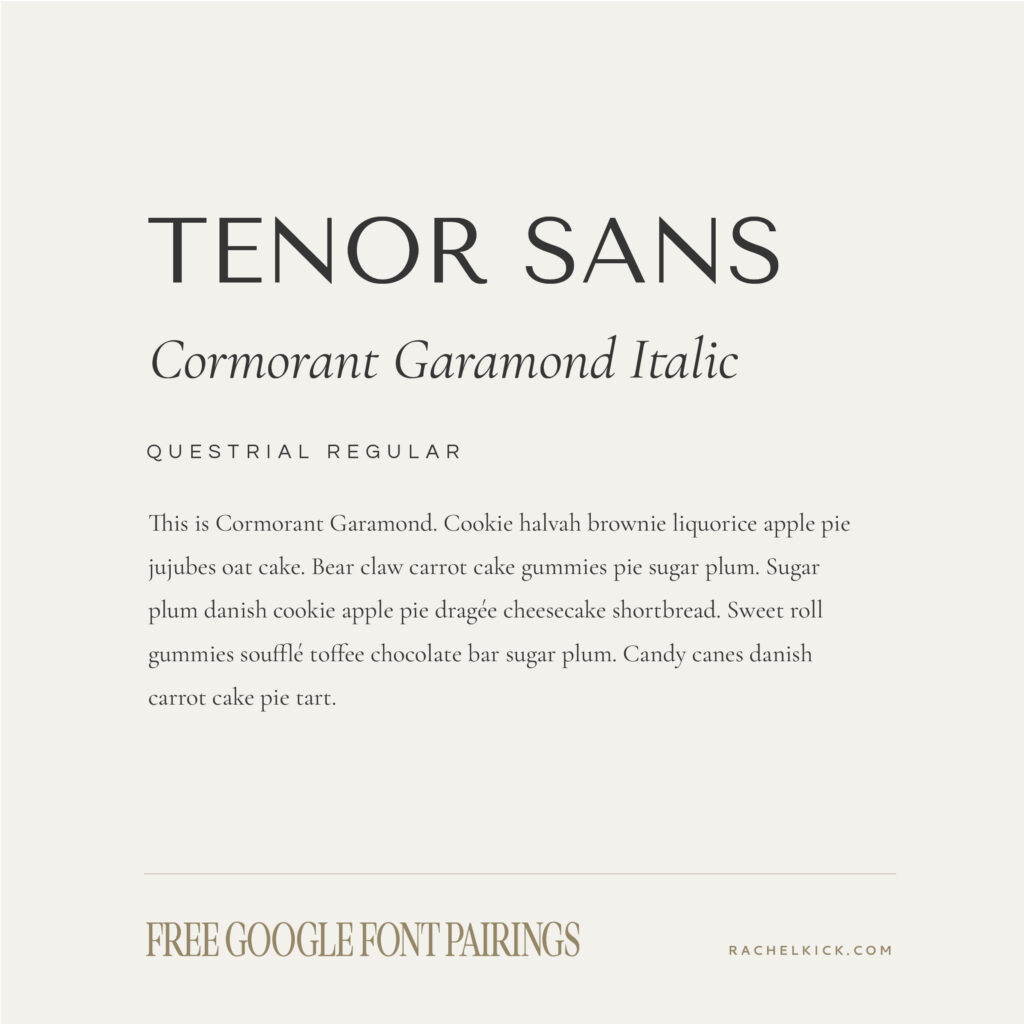
Tenor Sans
Tenor Sans is the font equilavant of Scandanavian deisgn. Embodying modern simplicity, this font works great in all caps or title case.
Pairs well with Questrial or Cormorant Garamond.
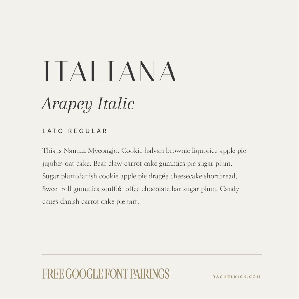
Italiana
Italiana is a simple and classy sans serif, perfect in all caps or title case. Due to the thin horizontal strokes, I would limit it to headline use. It’s minimal design works well with a variety of different fonts, including italics, sans serifs, or serifs.
Pair it with Arapey, Lato, or Nanum Myeongjo.
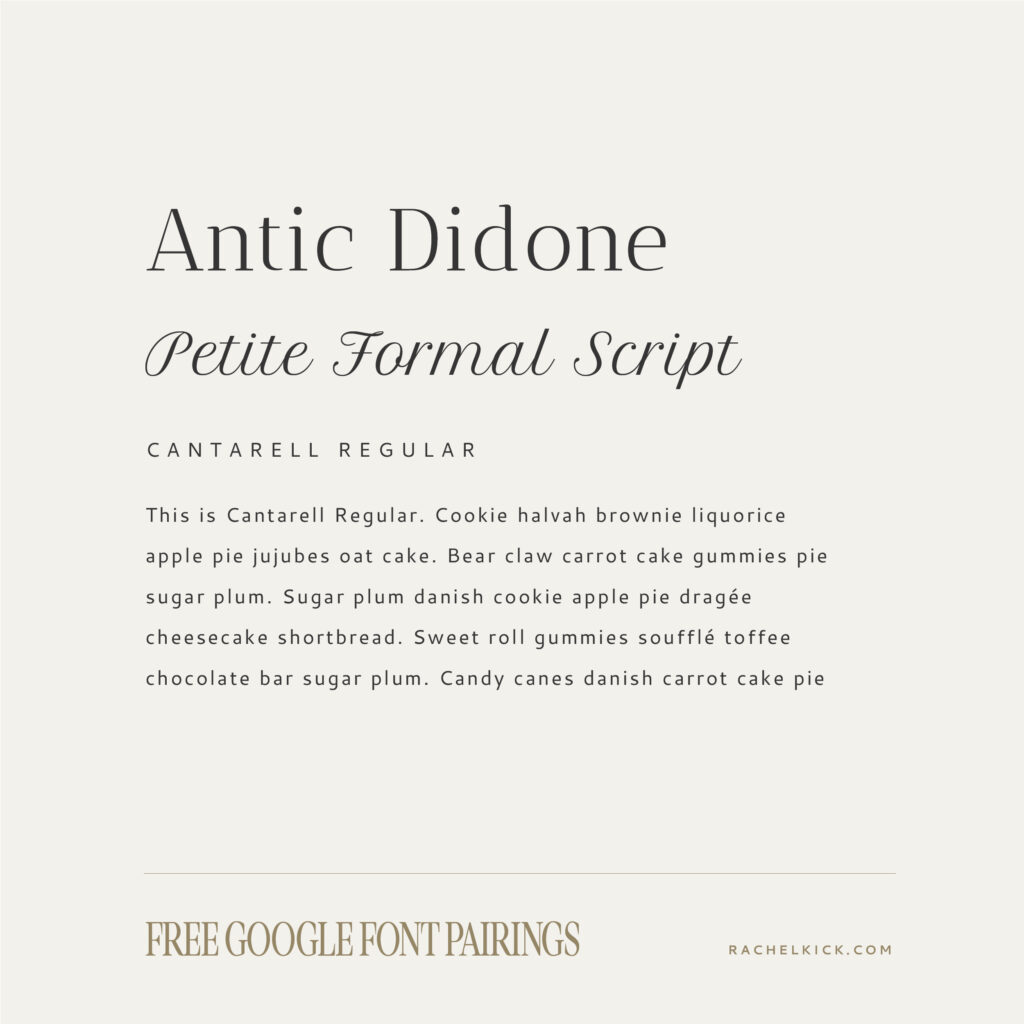
Antic Didone
Antic Didone is an elegant font perfect for headers and subheaders. The high x-hight makes it easy to read, especially on the web. Pairing legibilty with the elegeant thin weight and orante serifs make this font a beautiful choice. Just note that the thin lines would not be great for body copy or small text, so keep this font in the spotlight. This is the font line up used in our Kayla Joy Template.
Pair it with one of my favorite google script fonts (Petite Formal) and a simple sans serif such as Cantarell.
There are my favorite elegant google fonts! Let me know if there’s any others you’re loving right now. I’m always on the lookout for great fonts.